Putting Plain Language to the Test
I gave this talk at the Plain Language Summit in October 2020.
Thanks to Katherine Spivey and everyone at PLAIN for inviting me to speak, and to Zoe Blumenfeld, Madison Lowe, and Gregg Bernstein for thoughtful feedback on earlier drafts.
Katherine asked me to share some of the thinking behind the plainlanguage.gov redesign. I had an opportunity to work closely with her and PLAIN during my time at 18F. I thought it might be helpful to start with a brief history of the project, and then walk through some of the content research practices that I bring to my work.
Case study
So let’s travel back in time to March 2017 for a moment.
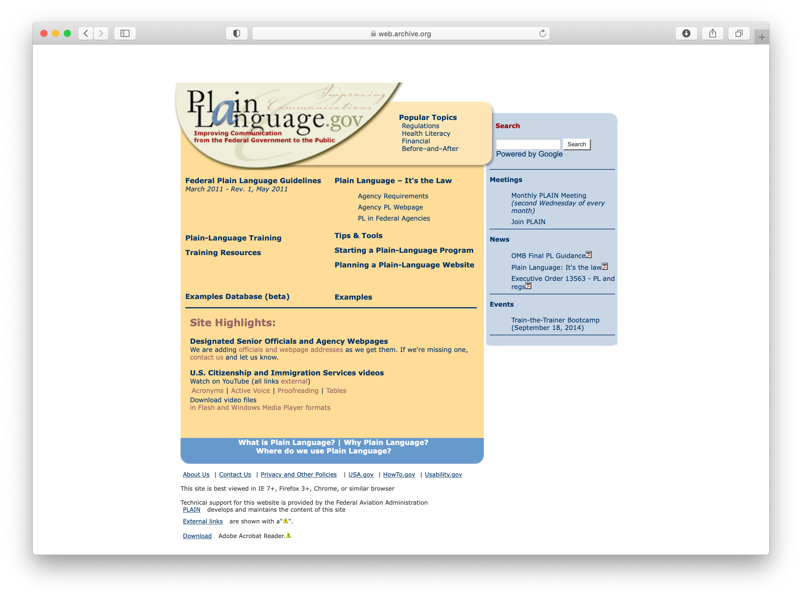
plainlanguage.gov was trapped in a legacy system that was hard to use and even harder to maintain. The General Services Administration (GSA) had just launched its 10x incubator program, which any federal employee can apply to. 10x funds incremental ideas that improve the public’s experience with government. So I decided without asking anyone to throw an idea into the hat. Here was the gist of my proposal:
plainlanguage.gov is a critical resource for civil servants. We need a modern and accessible site with up-to-date examples and resources for writing in plain language.
I wrote the required 2–3 sentences and got approval for 2 weeks of investigation work. I was on a project with the FBI at the time, so my colleagues Corey Mahoney and Cyd Harrell partnered with PLAIN to make the case for funding the redesign.
Ultimately, we got approval for 6–8 weeks of design and development work. Here’s the original timeline:
| August | September | October | November |
|---|---|---|---|
| Discovery | Prototyping | Usability testing | Transition |
| Kickoff, late August, 2017 |
Design Workshop, October 3, 2017 |
Launch, November 15, 2017 |
We got a lot done in that time:
- User and stakeholder interviews
- Content audit
- Sitemapping exercise
- Technical review
- Analytics review
- Prototyping
- Usability testing
- Launch planning
- Documentation
And here’s what the site looks like.
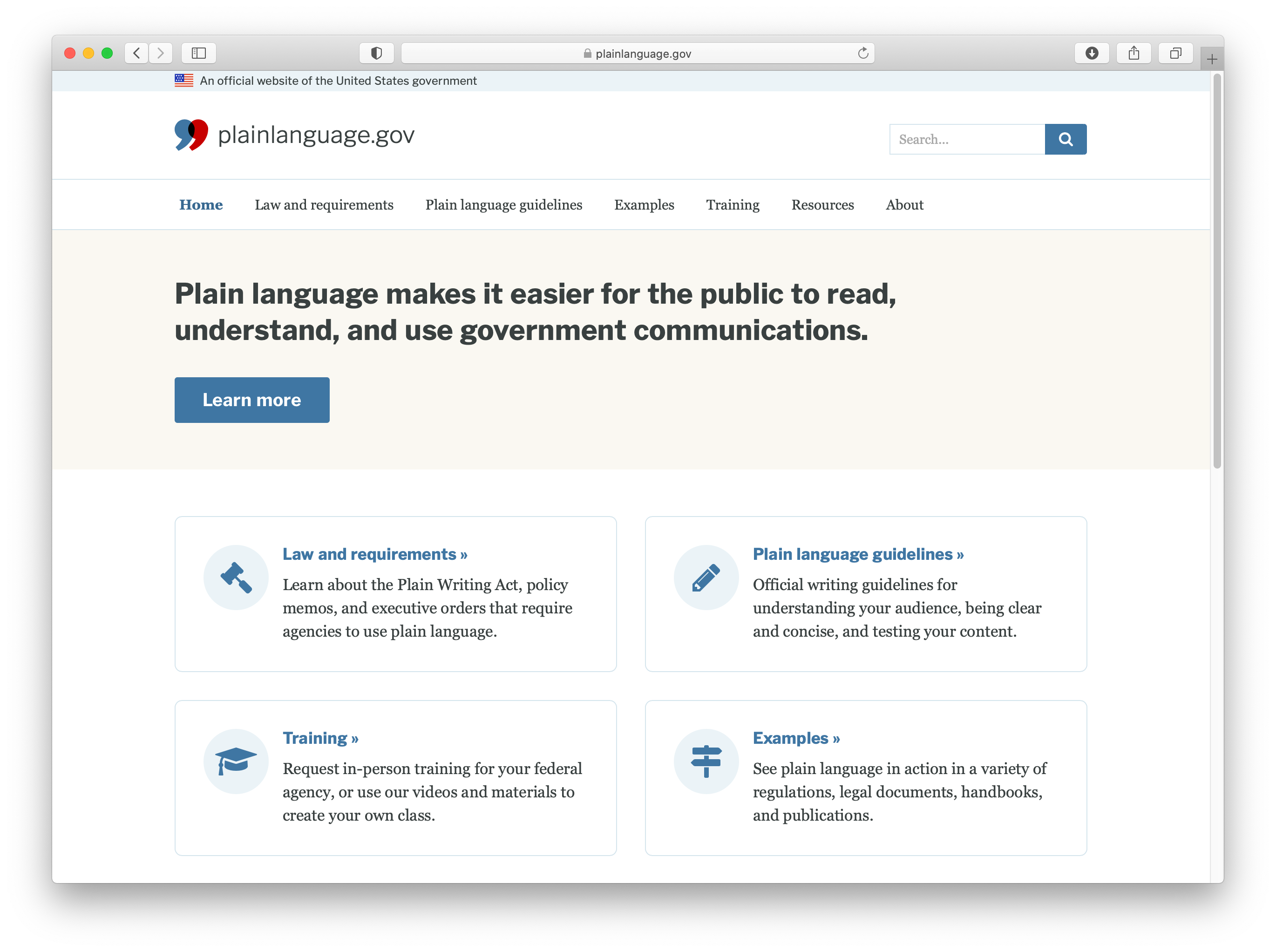
We had an amazing team, too. Kathryn Catania, Katherine Spivey, Miriam Vincent, and Wendy Wagner-Smith were our partners at PLAIN. They shared their needs and vision, helped recruit research participants from the community, and connected us with the Federal Aviation Administration (FAA) so we could get access to the raw content files.
Brian Hurst and I were the main designers on the project, but several of our colleagues at 18F and GSA pitched in. Ryan Thurlwell designed the gorgeous logo and custom components. Jeremy Zilar helped us move over to Digital.gov’s event management system. Lane Becker set up 10x as part of a larger program within GSA. Corey, Cyd, and the teams behind Federalist and the U.S. Web Design System set us up for success. And many of you shared feedback with us throughout the process.
Why plainlanguage.gov is an interesting case study
There are a lot of things that make this project interesting—it’s an evergreen resource aimed toward every federal employee and the content serves the public interest. (Plain language is the law of our land!) But I also think it’s an interesting case study for any government project where the content needs to shine.
PLAIN has a strong mission and a broad audience. According to the Office of Personnel Management, over 2.1 million civilians work directly for the federal government, plus 4.1 million contractors like me.
Like many government websites, the site was stuck in a legacy system, and they unfortunately lost access to the content itself. The FAA hosted the site for many years, but could no longer support the cost and server maintenance.
And like most projects, we were short on time and money, but wanted to deliver something great for our users. PLAIN is a team of volunteers. They have many other priorities as part of their full-time agency jobs. Since we’re all understandably working with split attention these days, I think it’s helpful to look back at a project like this where we were able to make positive changes quickly by focusing our efforts.
PLAIN also has extensive content. When people ask me about government projects, I think in terms of two modes: are you modernizing an existing site or building something new? Every project is different, but in this case, we didn’t need to start from scratch on the content. PLAIN has developed guidelines and training over literal decades by:
- Reviewing government publications
- Giving countless hours of feedback
- Leading workshops and discussions
- Identifying common questions from emails and events
- Working directly with usability experts in and outside of government
- Building this vibrant community without direct funding
Their editorial process was already mature. We mainly needed to repackage all of this incredible, high-quality content so it was easier to use and navigate. So whether you’re modernizing an existing site or building something new, I hope you’ll try out some of the content research methods from this talk.
Where research comes in
Before our kickoff with PLAIN, we had some high-level goals:
- Make it easier to find and navigate the content
- Use existing tools like Federalist and the U.S. Web Design System to modernize the publishing process
- Expand PLAIN’s reach and amplify their mission
We also had some open questions about user needs and priorities:
- What are the highest priority improvements for PLAIN and our users?
- Which topics or content types are most useful?
- How should we organize the content generally?
- How might we better highlight top content and plain language examples?
We may be web experts—and working with expert content—but we didn’t know everything we needed to know to serve our users. What’s important is we knew how to find the answers. That’s where research comes in.
I love this quote from Gregg Bernstein:
“User research brings us closer to the people we serve in order to design better experiences.”
From talking with Katherine and Miriam, we knew that the people we were trying to reach were “writers by necessity.” They’re not formally trained in writing or usability experts. They’re probably wearing multiple hats in their agency or department, and writing is just one part of their job. So we wanted to know more.
And this brings me to the heart of what I want to share with you today: I may know a lot about writing and design, but I was not PLAIN’s primary audience. I don’t know what other civil servants need to meet a federal mandate. I can’t speak for everyone.
As writers and designers, we can pretend to be the arbiters of plain language, but nobody knows better than our users. No matter how we’re trained or where we’ve worked or who we’re writing for, we can’t scale effectively without research. We have to bring users into our workflow.
The purpose of the Plain Writing Act is specifically to:
“Improve the effectiveness and accountability of federal agencies to the public by promoting clear government communication that the public can understand and use.”
We have a responsibility and a privilege to imagine a better government. If we read between the lines of the Plain Writing Act, we can imagine a government that answers questions clearly, solves problems that affect hundreds of millions of people, and builds trust and accountability.
The American people have questions for us. Questions like:
- How can I stay safe during the pandemic?
- What will the weather be like this week?
- What do I owe, or where’s my refund?
- What is the air quality like near me? Is it safe to go outside?
- If I want to speak out about injustice, how can I do that?
At best, we can meet their needs, save time and money, and even save lives. At worst, our content can be confusing or frustrating, costly, dehumanizing, or dangerous.
We may talk about our work as upholding a standard—is it plain or not? Is it useful or not? Does it meet the guidelines or not? But content work doesn’t fit neatly into a binary. Language and design are inherently subjective. So what I want to offer as framing for this talk is that plainness is not the ultimate goal. Plainness is a step toward a more understandable, trustworthy, and inclusive government.
Our work has to be clear—for hundreds of millions of people. If we want to get as close to that as possible, we need to test our content and our assumptions along the way.
Let’s look at some lightweight ways to do that.
Content research methods
Before you start talking to users, it’s important to get on the same page internally. Clear goals help you build a shared language and a foundation for your research questions and hypotheses.
For PLAIN, we started with some broad goals, but we needed to dig deeper to understand their long-term vision. What did they want to accomplish in the next few years? How did they see their community growing and evolving over time? How could we make sure this site design would last for another 5–10 years until the next one?
1. Make a Mad Libs exercise
One of my favorite ways to align on goals is to make a simple Mad Libs exercise. Sara Wachter-Boettcher has a nice post called Content Mad Libs where she walks you through the process.
For the design workshop with PLAIN, I made a printable worksheet that we filled out in person—but you can also do this remotely with a shared thread, Google form, or by having folks take a picture of their answers on paper. It’s kind of like a lightweight survey.
The new plainlanguage.gov will help civil servants [user goal] and [user goal].
To do this, we must deliver content that is [adjective], [adjective], and [adjective].
The new site will help PLAIN [internal goal] by encouraging users to [user task], [user task], and [user task].
What I like about this is that it helps us find common ground, and places where people use different words to mean similar things. Afterwards, you can take the responses from your team and summarize them into a concise strategy statement. Here’s an example from my current project at Nava with the state of Massachusetts:
Notifications will help claimants and employers understand where they are in the application process, make informed decisions, and reduce delays in processing.
To do this, we must deliver content that is actionable, relevant, and consistent with the portal and Mass.gov...
This ultimately guides the content design work and highlights areas for future testing.
2. Use direct quotes
Interviews are a core part of content research, and I find them to be extremely helpful for learning about people’s needs and experiences in their own words.
Before we started prototyping designs for PLAIN, we led some stakeholder and user interviews to understand what people did and didn’t like about the existing site. We worked with their training coordinator to recruit users who had explicitly requested plain language training for their agency or department.
After the interviews, we pulled direct quotes into a presentation to share what we heard. I find direct quotes to be really powerful—whether you’re quoting an interview, a support email, or an in-person interaction. Put your users’ voices at the center of your process.
Your team will better understand how people think and talk about your service, which can help you improve your site navigation, user trust, and overall engagement. Using direct quotes also helps you check your own biases, because you’re not paraphrasing or manipulating the data.
If you’ve ever done user research at the federal level, you’ve probably heard of the Paperwork Reduction Act (PRA). Some folks mistakenly believe that this law says research is illegal. It’s not, of course, but lucky for us, 18F and the Office of Management and Budget partnered to create a guide for doing research and working under the PRA at pra.digital.gov.
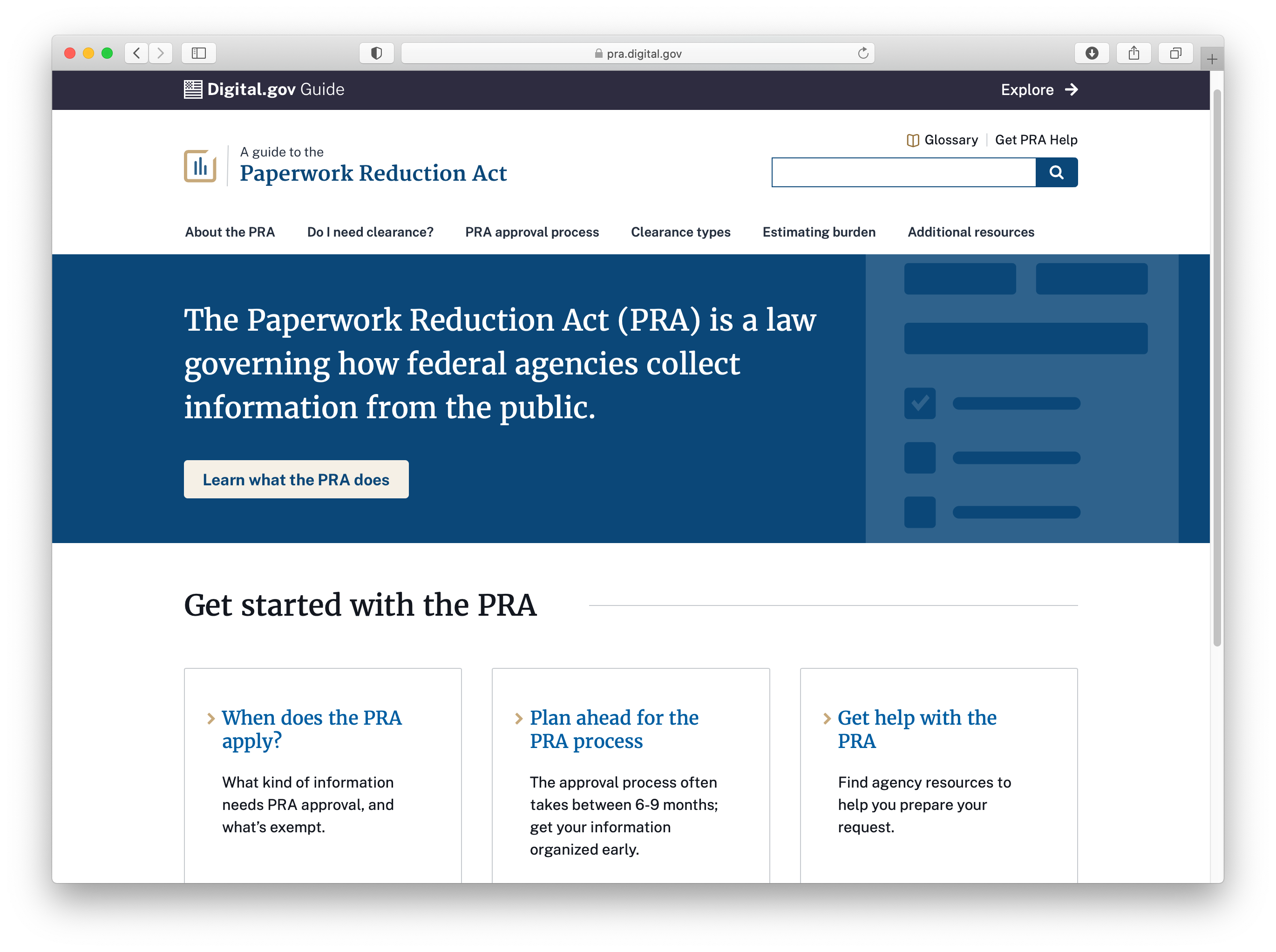
The Paperwork Reduction Act did not apply to PLAIN since we were talking to federal employees, but you can hold similar loosely structured conversations with members of the public.
Now that you have a clearer sense of purpose, it’s time to roll up your sleeves, dig into the content, and validate your assumptions. So what do we do with all of this content?
3. Audit strategically
If you’ve never done a content audit, Lisa Maria Marquis has a fantastic article in A List Apart to guide you. What I would add for civil servants is to keep these things in mind:
You don’t have to audit everything at once. Think strategically and topically along the way. Try to get a full snapshot of the data and then narrow your focus to content that lines up with current priorities.
Whenever I’m doing an audit, I ask an engineer or IT person to give me a full list of URLs and page titles from the site. They may need to do that with a script or pull the public URLs from the web. This will save you time and headspace to focus on the content itself.
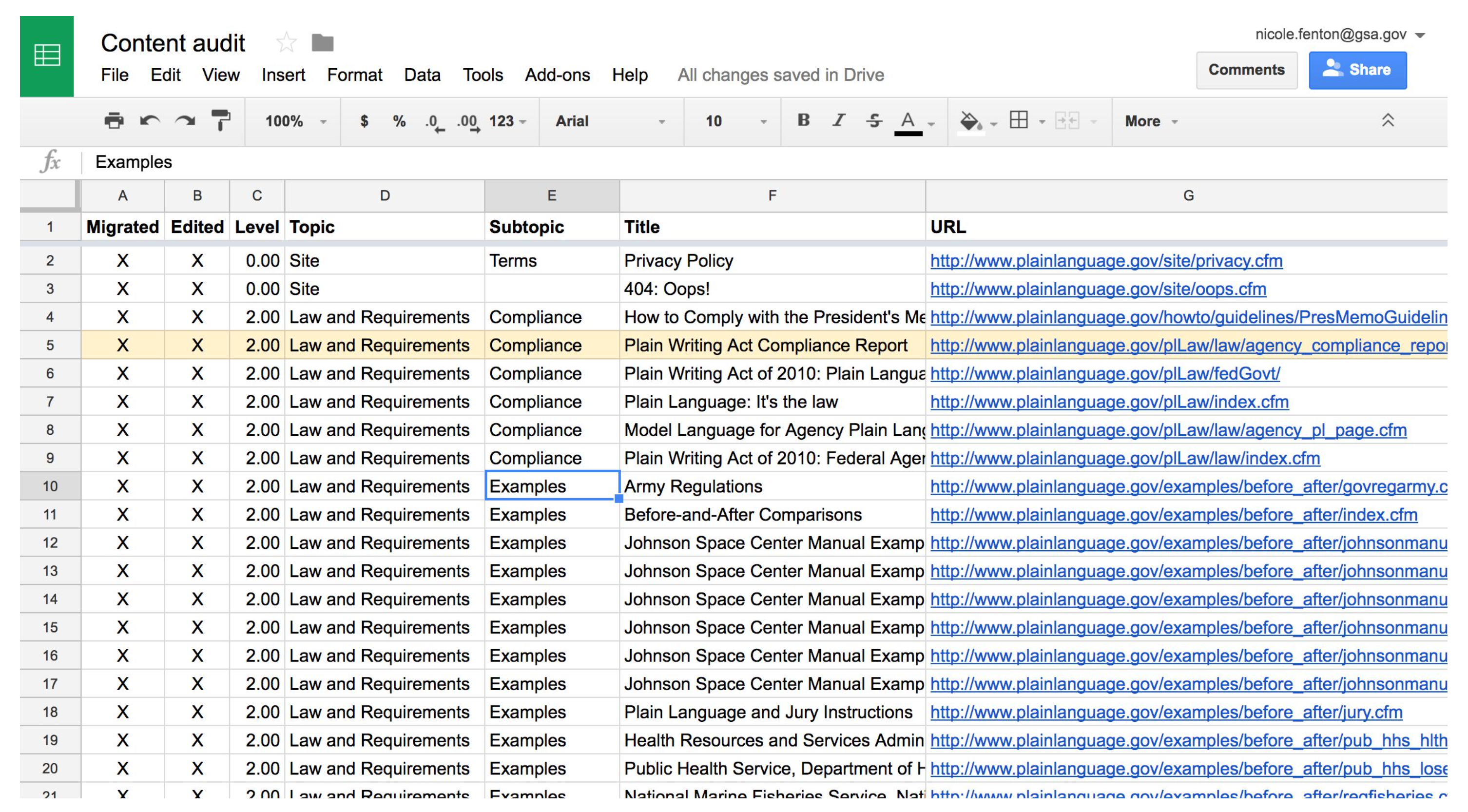
Frame your audit around top tasks and topics for users. Top tasks might include learning about the program, applying for benefits, or checking the status of a claim, for example. Map the content up with the overall experience to find gaps and opportunities. Nava has a great guide to making a service blueprint, or diagram of your entire service, which can help you with the process.
If you have site analytics, find the top 20–30 pages based on traffic and review them closely. You’ll find a handful of important rewrites to make, and can probably retire some overlapping or outdated content. Make sure to redirect any old pages to help people and search engines get to the right place. I like to map redirects in a second tab within the audit spreadsheet.
Once you’ve completed your very strategic audit, you can move on to making a sitemap and thinking about testing opportunities.
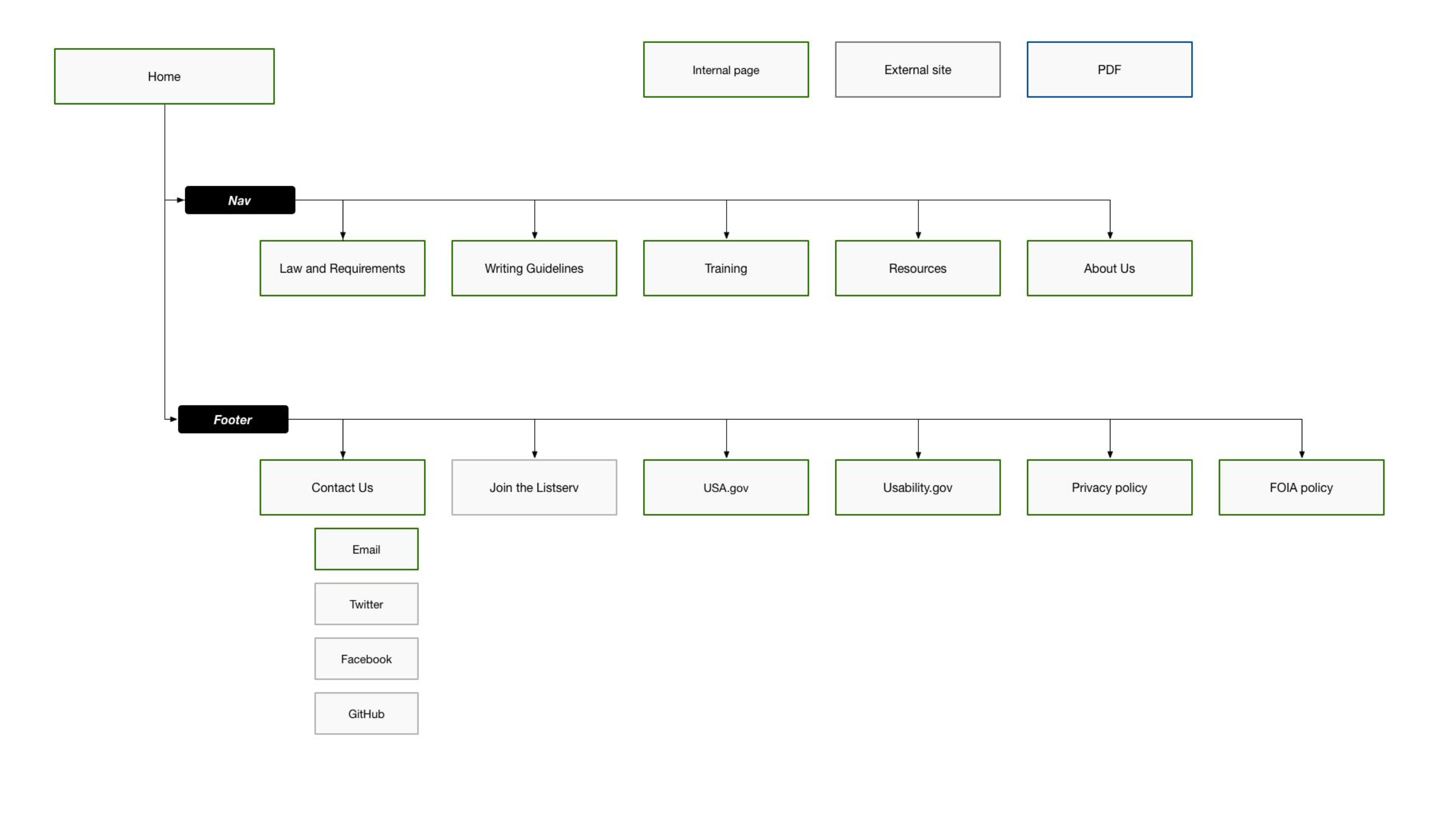
4. Test content in context and on its own
When you’re ready to test your content, try to plan at least two studies. It’s helpful to see how people react to the overall experience where the content is part of the design. That’s typical usability or prototype testing. For detailed information that you want people to read carefully—such as inline instructions or a paper form—I also recommend testing the text on its own.
We did three different kinds of tests for PLAIN: prototype testing, a tree test to improve the site navigation, and then preference testing on table styles.
In prototype testing, we showed users some early designs to get their feedback on the structure and overall design direction.
Next, we tested the navigation and hierarchy of the site in a tree test with an app called Optimal Workshop. In this kind of test, you make a nested list of all of the main page titles and ask users where they’d expect to find a particular topic. All of the work you did on the content audit leads to this.
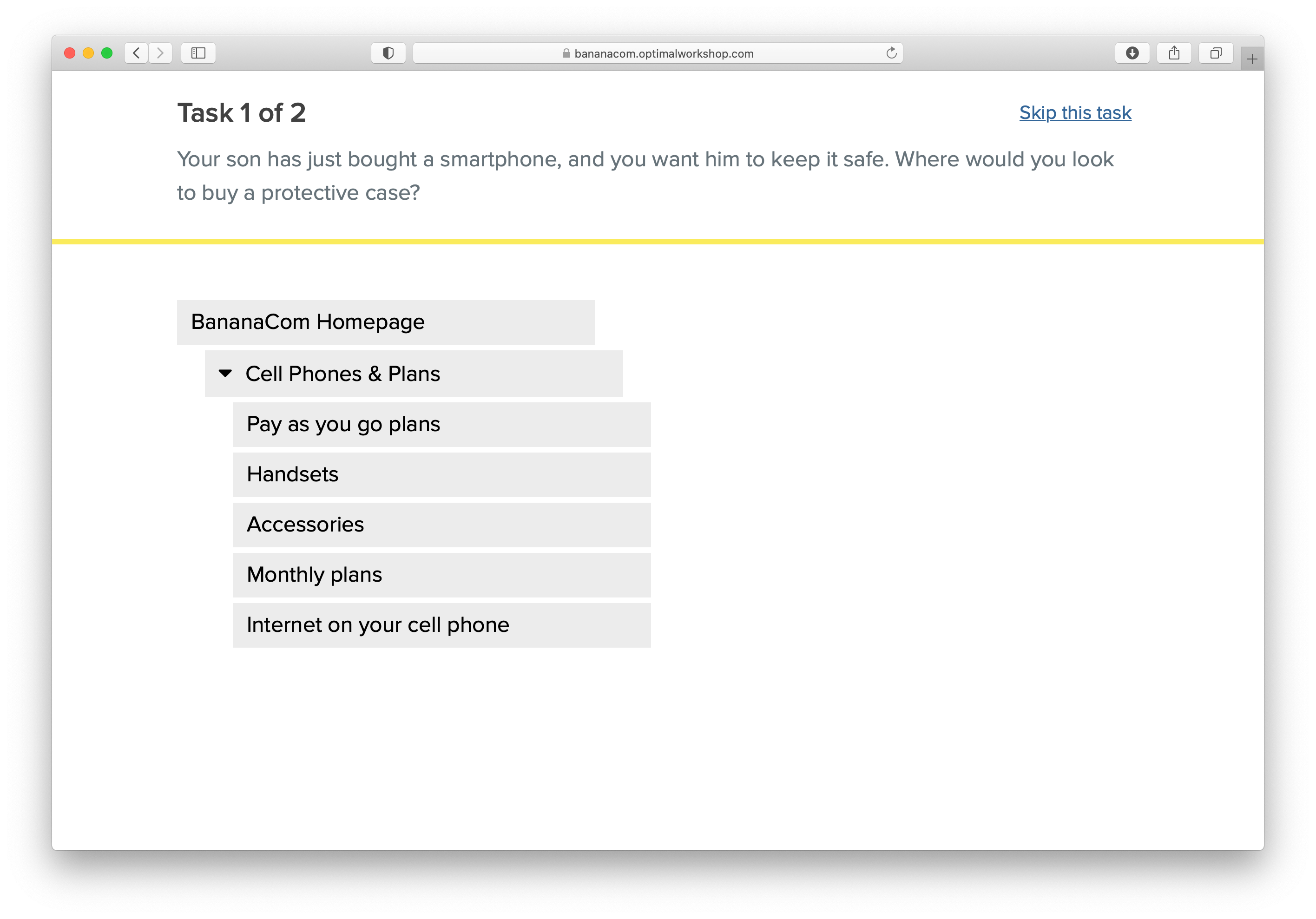
From these two studies, we learned that we were headed in the right direction but need to make a few adjustments. We renamed some links, and moved a couple of topics around to better meet user expectations. We also heard how important the examples were.
“The most effective things for me is to see what not to do, and then an explanation. Examples are the thing that really helped me understand it.”
We decided to do some preference testing on different table styles for showing before-and-after content. You might think of this as a visual design exercise, but it ultimately shaped how we structured the content. Here’s a look at the design we went with:
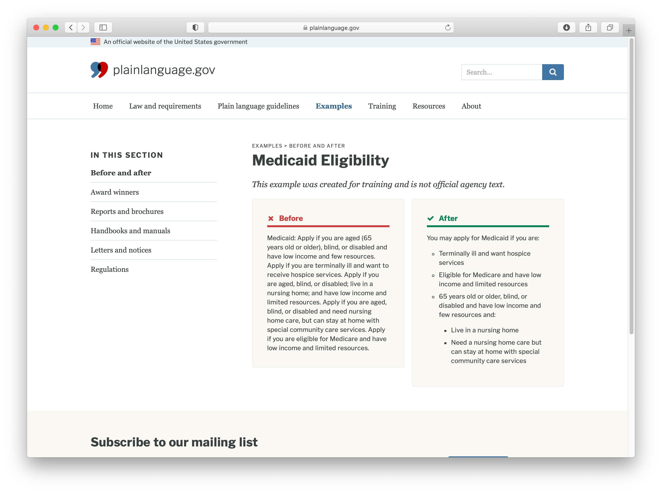
There are many different ways to test your content with users, and Josh Tong has a great roundup on his blog for your reference. (Some folks asked about Cloze and Flesch–Kincaid readability tests in the Q&A, but I personally don’t recommend those.)
5. Assume the data exists
Now you may be thinking, hey, I’ve got a regulatory deadline and I don’t have time to run these kinds of tests. And while I disagree with you, there are some other ways to validate your content without testing it directly.
To quote my friend Gregg Bernstein again, one way to practice user research is to assume the data exists. You can find out a lot about your users by reaching out to your colleagues and doing some data collection. This will also help you build healthy feedback loops and relationships internally.
Here are some questions to consider:
- What are the top questions we hear from our contact center or email group?
- What are people talking about on Twitter and other social media channels?
- Do we have site analytics? What are the top search keywords or click paths?
- Is our agency or department already creating reports around web traffic or contact center data?
For PLAIN, we knew Katherine and Miriam had a good pulse on content needs from the mailing list. I spent some time going through PLAIN’s Twitter mentions and seeing what people were linking to frequently. We also interviewed their training coordinator to understand how to improve the site for training specifically. For larger programs, I recommend interviewing contact center managers and shadowing customer service representatives to see what their days look like.
All of this information will help you think about the process your users are experiencing, and shape the content around their needs.
6. Keep the conversation going
It’s up to us to ensure our content works for users. So whether or not you can do content testing before a deadline, keep the conversation going with your users and your colleagues who talk to them regularly.
Don’t just push out new content because you have to. You have an opportunity to build trust and clarity every time you publish.
Make it easy for people to give you feedback or suggestions. For plainlanguage.gov, we moved to GitHub for tech reasons and so folks can make issues and contributions directly.
To wrap up, here are some of the practices I recommend bringing to your work:
- Make a Mad Libs exercise
- Use direct quotes
- Audit strategically
- Test content in context and on its own
- Assume the data exists
- Keep the conversation going
For more about my approach, check out the case studies from my time in government in Margot Bloomstein’s new book, Trustworthy.
If you have other ways of testing your content and your assumptions, I’d love to hear from you. Thank you.
Further Reading
- Design and Research in Critical Times, 18F
- Plain Language Templates for User Research, Nava
- Practical Advice for Testing Content on Websites, Nielsen Norman Group
- Service Blueprinting, Nava
- User Research for Improving Forms, Nava